Data Visualization Cheatsheet: Choosing the Right Chart for Your Data
- Debapritam Mishra

- Aug 25, 2025
- 3 min read
Data visualization is one of the most powerful tools for learning and storytelling with numbers. Whether you’re a student trying to present survey results, or a professional analyzing big data, choosing the right chart can make all the difference. The wrong chart can confuse your audience—but the right one can instantly highlight insights.
In this blog, you’ll find a data visualization cheatsheet packed with explanations, examples, and images of popular chart types. Bookmark this guide—it will be your go-to reference for assignments, projects, and presentations!

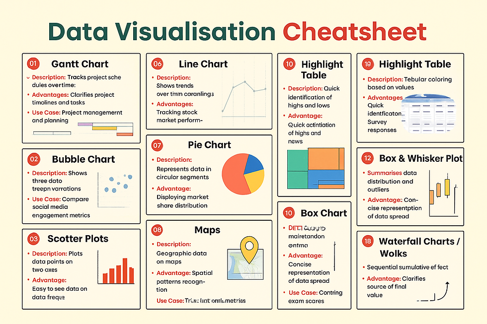
📊 1. Gantt Chart
Description: Tracks project schedules over time.
Advantage: Clarifies project timelines and tasks.
Use Case: Project management and planning.
🔵 2. Bubble Chart
Description: Displays data in bubble size variations.
Advantage: Shows three dimensions of data.
Use Case: Comparing social media engagement metrics.
⚫ 3. Scatter Plot
Description: Plots data points on two axes.
Advantage: Identifies correlations and clusters.
Use Case: Analyzing the relationship between variables.
📉 4. Histogram Chart
Description: Visualizes data distribution in bins.
Advantage: Easy to see data frequency.
Use Case: Understanding age distribution in a survey.
📊 5. Bar Chart
Description: Visualizes data with rectangular bars.
Advantage: Clear comparison of different groups.
Use Case: Comparing sales across different regions.
📈 6. Line Chart
Description: Shows trends over time with lines.
Advantage: Clear display of data changes.
Use Case: Tracking stock market performance.
🥧 7. Pie Chart
Description: Represents data in circular segments.
Advantage: Simple proportion visualization.
Use Case: Displaying market share distribution.
🗺 8. Maps
Description: Geographic data representation.
Advantage: Spatial patterns recognition.
Use Case: Visualizing population density by area.
🎯 9. Bullet Charts
Description: Measures performance against a target.
Advantage: Compact alternative to gauges/meters.
Use Case: Tracking sales performance against quotas.
🔦 10. Highlight Table
Description: Tabular data colored based on values.
Advantage: Quickly identifies highs and lows.
Use Case: Heatmapping survey responses.
🌳 11. Tree Maps
Description: Hierarchical data with nested rectangles.Advantage: Efficient space usage for categories.Use Case: Displaying file system usage.
📦 12. Box & Whisker Plot
Description: Summarizes data distribution and outliers.Advantage: Concise representation of data spread.Use Case: Comparing exam scores across classes.
💧 13. Waterfall Chart
Description: Visualizes sequential cumulative data.Advantage: Clarifies sources of final values.Use Case: Understanding profit and loss components.
Why Students Should Care About Data Visualization?
Data visualization isn’t just for analysts or researchers—it’s a critical skill for students too! Whether you’re:
Presenting survey results in class,
Creating a science project report, or
Working on a business case study,
Using the right chart can boost your grades and make your presentation stand out.
If you are looking for the best Data analytics training institute in Bhubaneswar that offers industry-oriented courses, expert faculty, and real placement opportunities, Aptech Learning Nayapalli should be your first choice. Located in the heart of Bhubaneswar at Nilakantha Nagar, Nayapalli, Aptech has been empowering students since 1986 and has trained over 75 lakh students worldwide.
With a strong legacy in vocational IT education, Aptech bridges the gap between academic learning and professional skills, preparing students for high-growth careers in Data Analytics, web development, digital marketing, data science, networking, and more.
"Book an appointment” for a free career counselling session in Data Science through the form available on our homepage. You can also refer a friend to help them explore this opportunity.
![You can use Gemini AI for interview preparation. [Resume Analysis, Profile match%, Likely question]](https://static.wixstatic.com/media/51caee_9fd4c61922bb45198f2e293960f52155~mv2.png/v1/fill/w_980,h_595,al_c,q_90,usm_0.66_1.00_0.01,enc_avif,quality_auto/51caee_9fd4c61922bb45198f2e293960f52155~mv2.png)


Comments